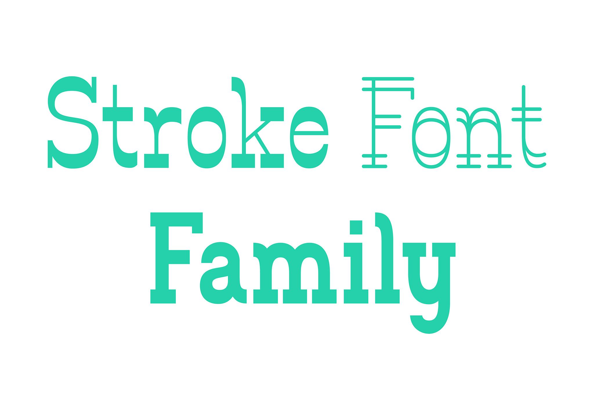
STROKE FONT FAMILY
Typeface design and research, investigating how tools influence the shape of letterforms.
Background
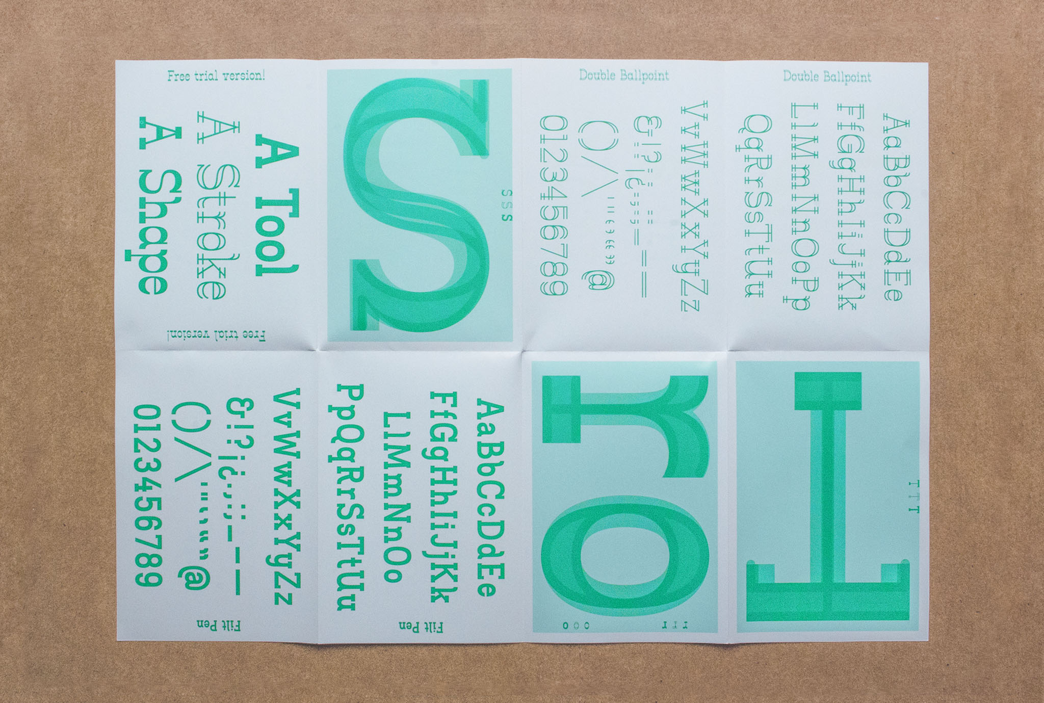
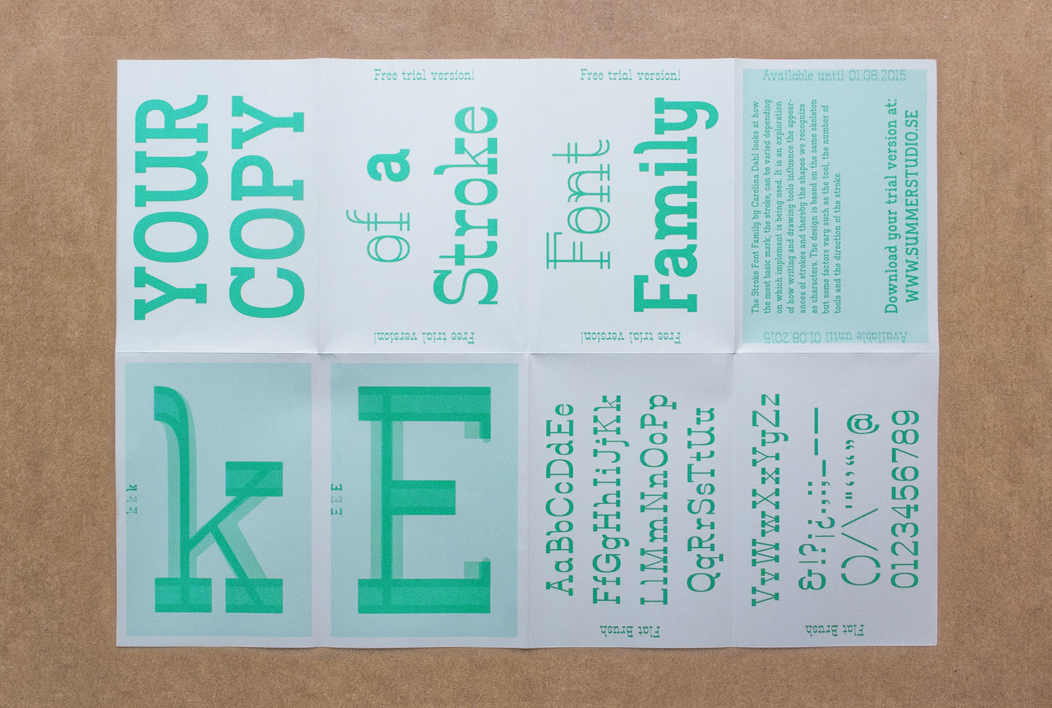
The Stroke Font Family consists of three display fonts; Flat Brush, Double Ball-point Pen and Filt Pen. The names reference the tools that brought the characteristic looks to the fonts. The font family started out as an exploratory project and looks at how the most basic mark, the stroke, can be varied depending on which implement is being used.
Design
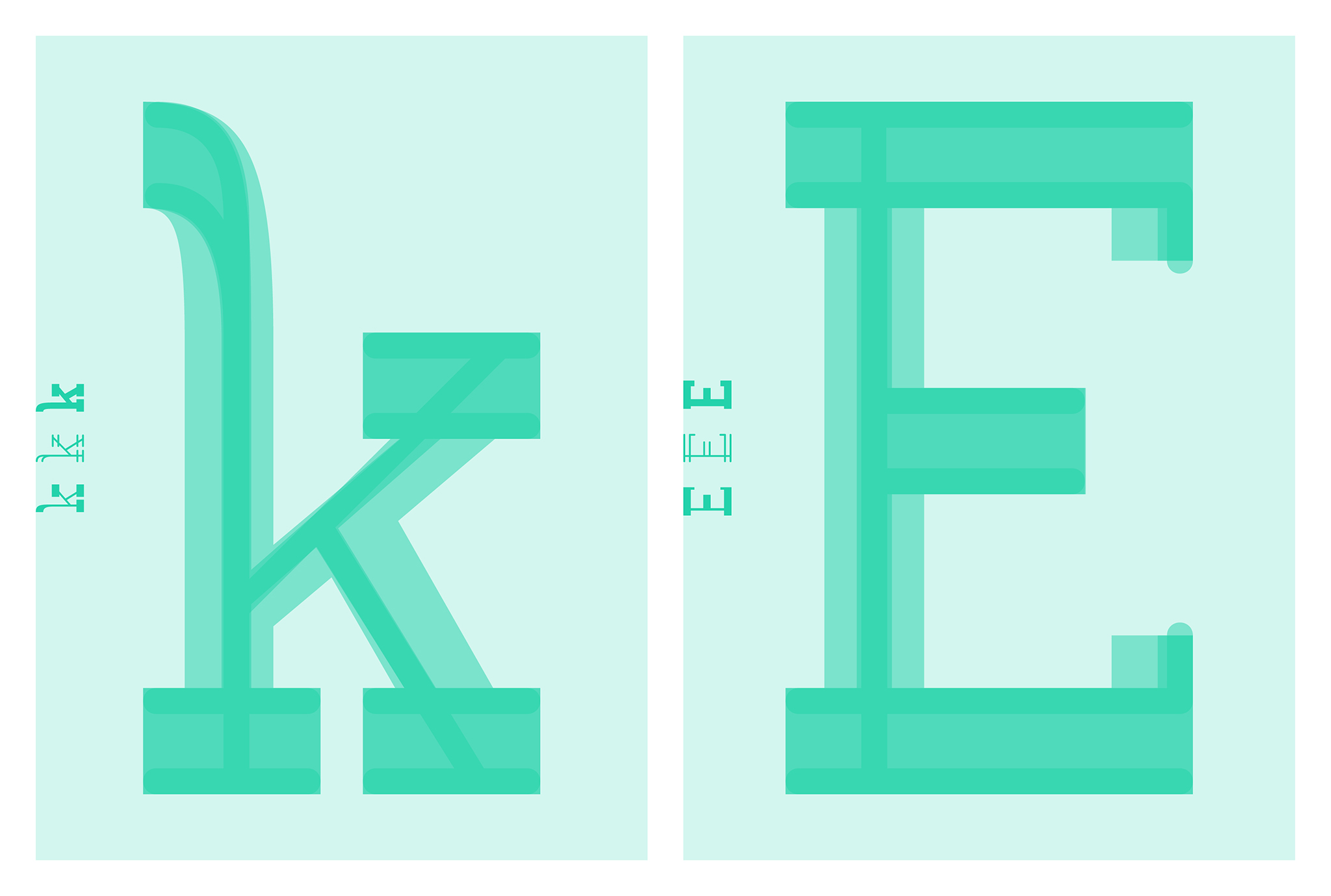
The design explores how writing and drawing tools influence the appearances of strokes and thereby the shapes we recognize as characters. The font design is based on the same skeleton but some factors vary such as the tool, the number of tools and the direction of the stroke.
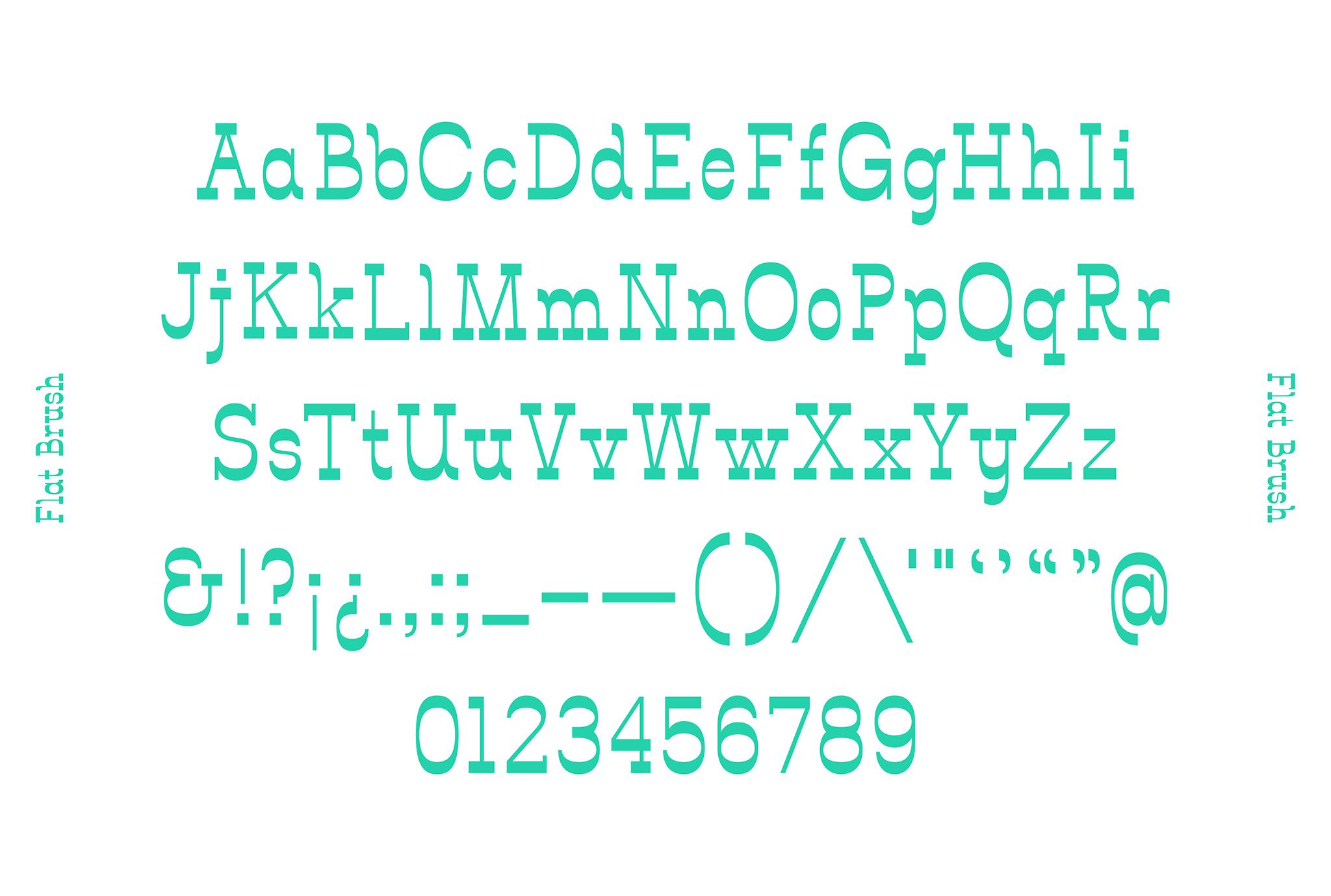
Flat Brush
The tools and the way of using them are chosen to give the characters a strong visual impact. Wide, fluid strokes from a vertically held flat brush gives a high contrast font.
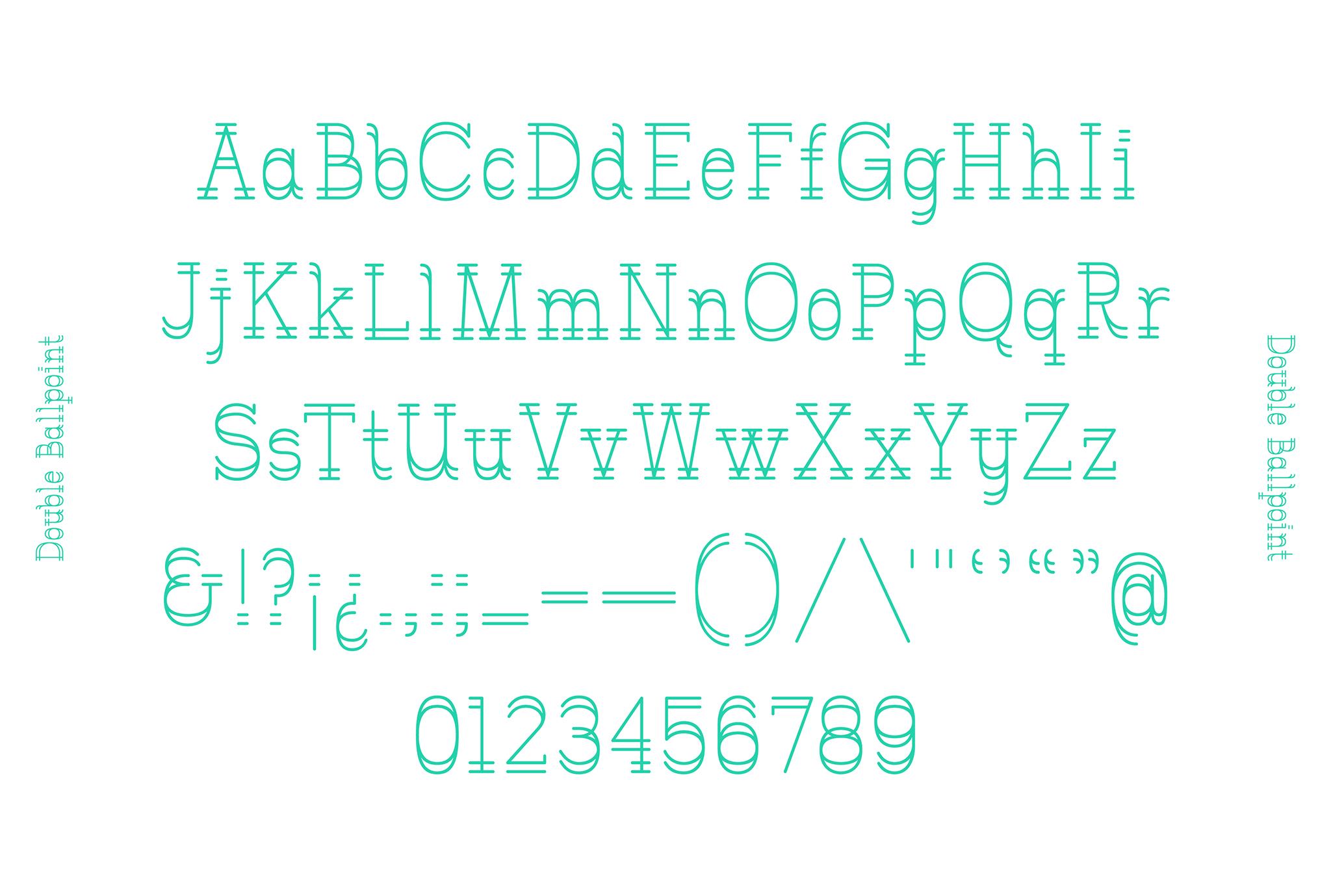
Double Ballpoint
The mark of the double ballpoint pen is light. However, a double up of pens creates an extra visual punch.
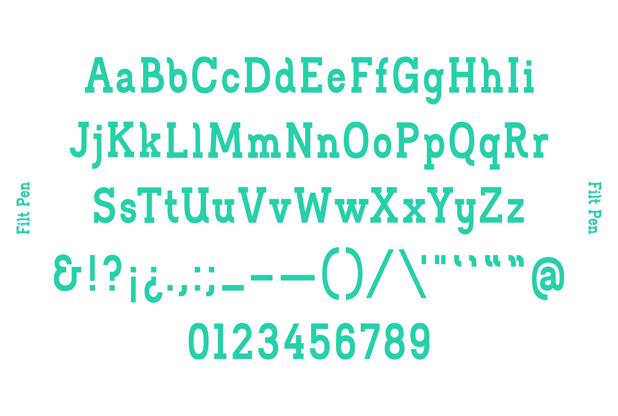
Filt Pen
Sturdy, chunky strokes from a filt pen rotating around itself makes Filt Pen to the boldest but also the most readable font.
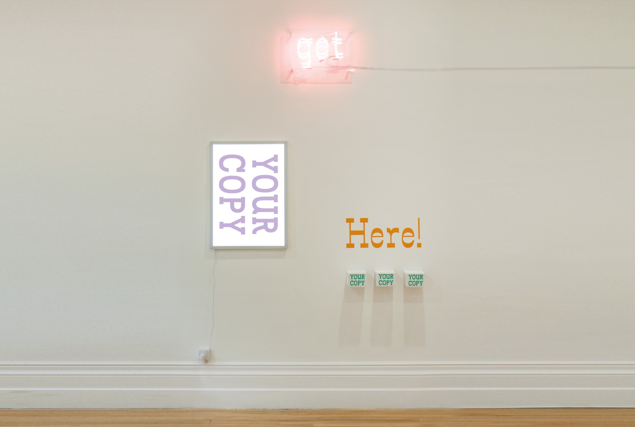
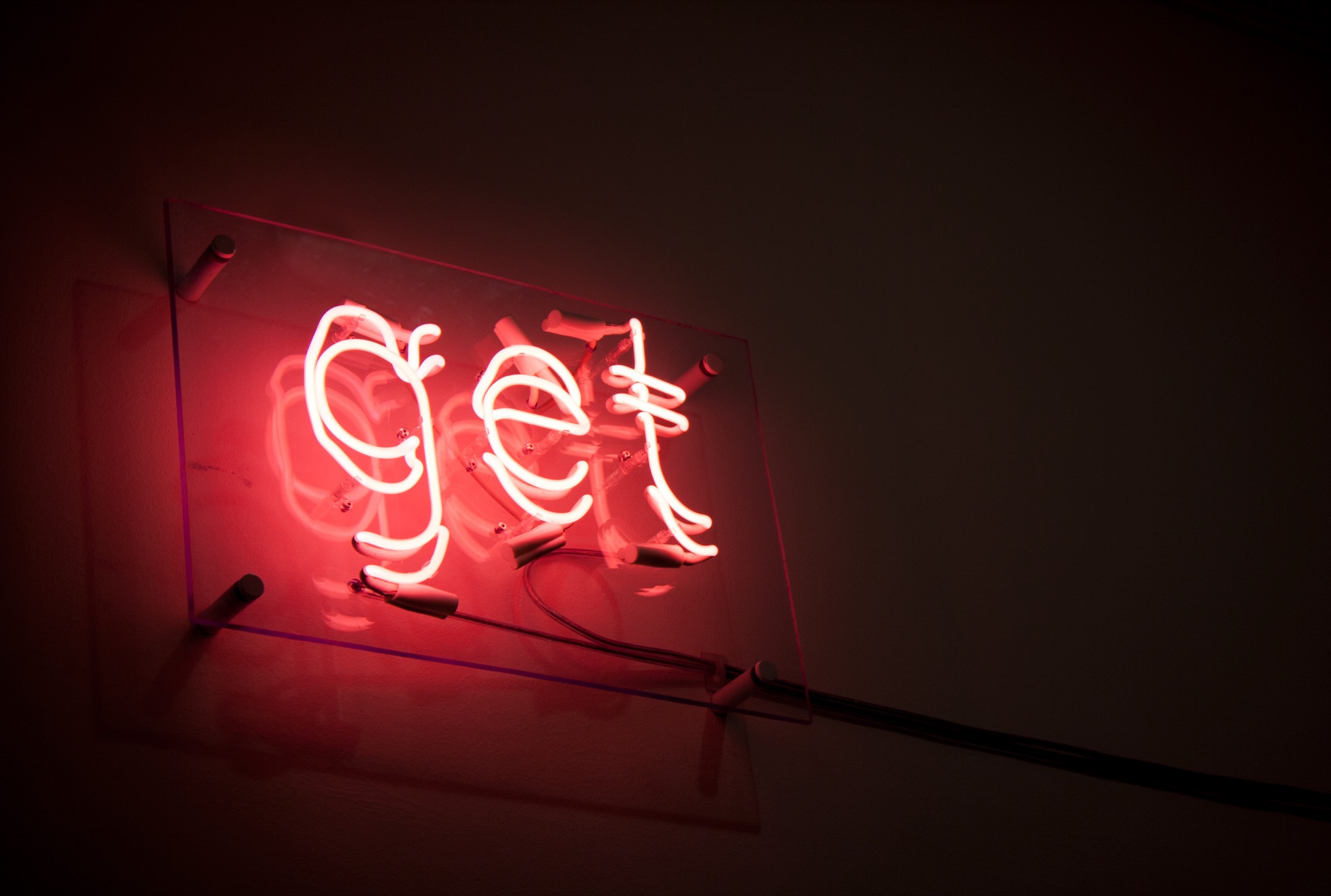
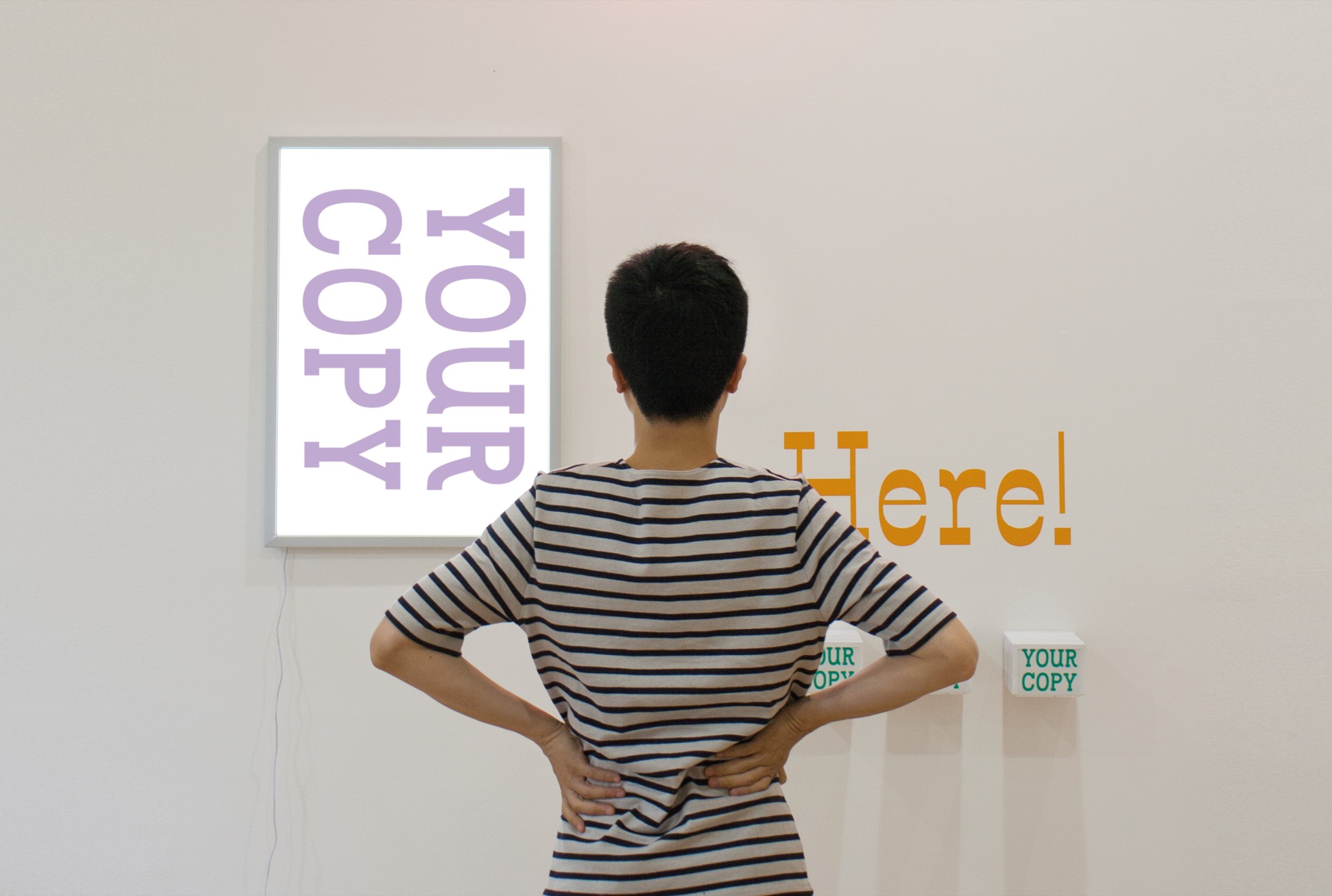
Exhibition piece
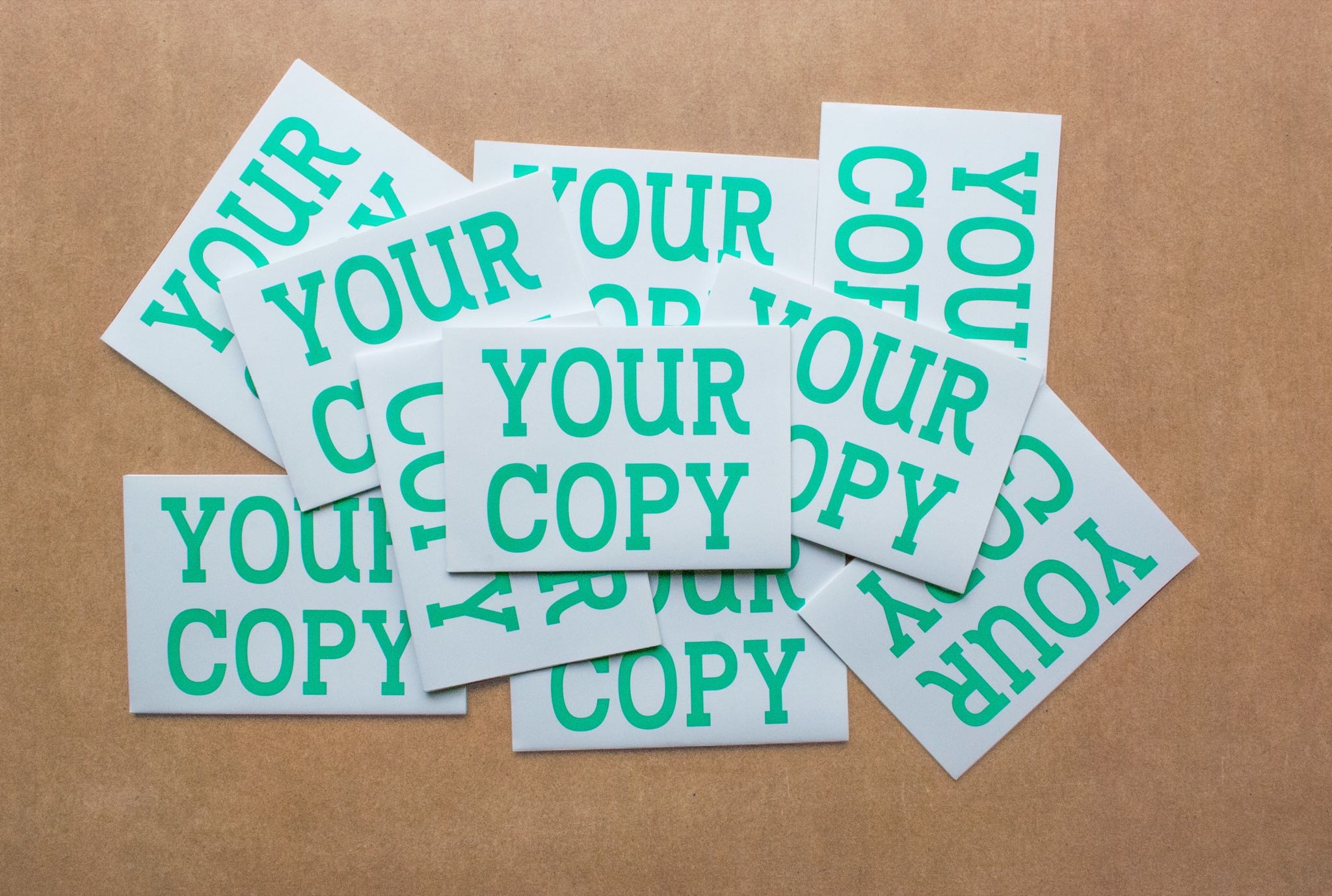
Display fonts on display at the Royal College of Art Final Show in 2015 where a free trial version of the font family was handed out to the visitors.
The fonts have also been used in some of Summer Studio cases, Ill-Informed and The Bikery.
If you are interested in using any of the fonts please email info@summerstudio.co.uk.