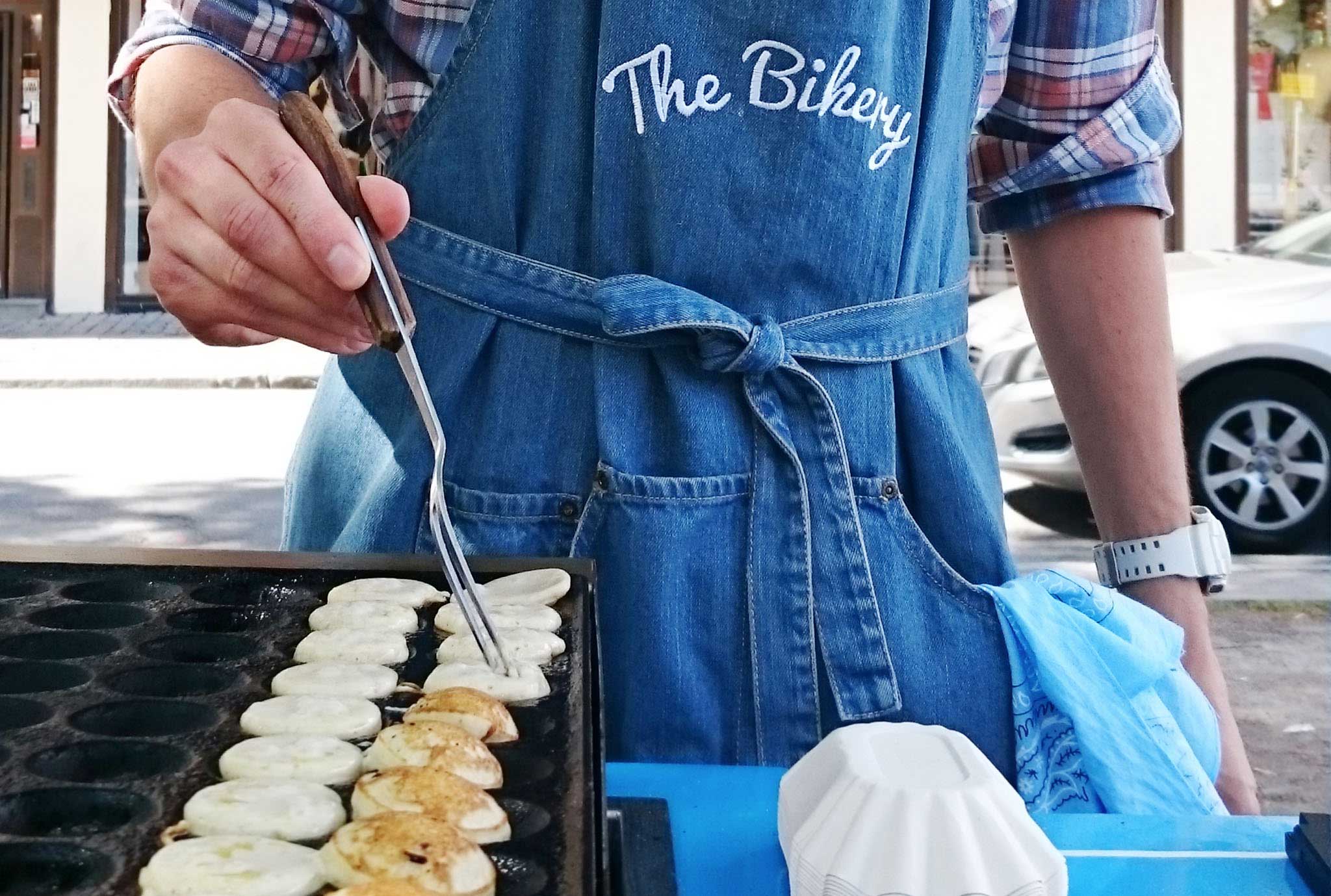
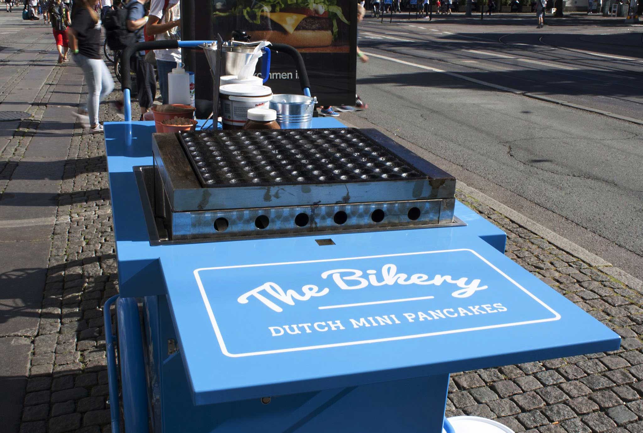
THE BIKERY
Corporate identity for start-up food bike concept ”The Bikery”.
Background
The food-bike concept was initiated by Marc Plasmans in 2015 as way to bring Dutch mini pancakes to the city of Göteborg. It combines two things that Dutch people are very fond of, biking and pancakes. The concept name does not refer to anything Dutch or mini pancakes, therefore it does not exclude other product categories to be added later on. It gives the company potential to grow as a wider concept and the opportunity to spread outside Göteborg as a franchise.
Brief
The brief was to create a visual identity that is friendly and inviting, to successfully launch the concept and the mini-pancakes to the Swedish market. A logo and a design for the pancake bike, both classy and fun, with a subtle ‘wink’ to the Dutch heritage was requested. The identity also had to be highly visible to stand out and attract customers on the busy street.
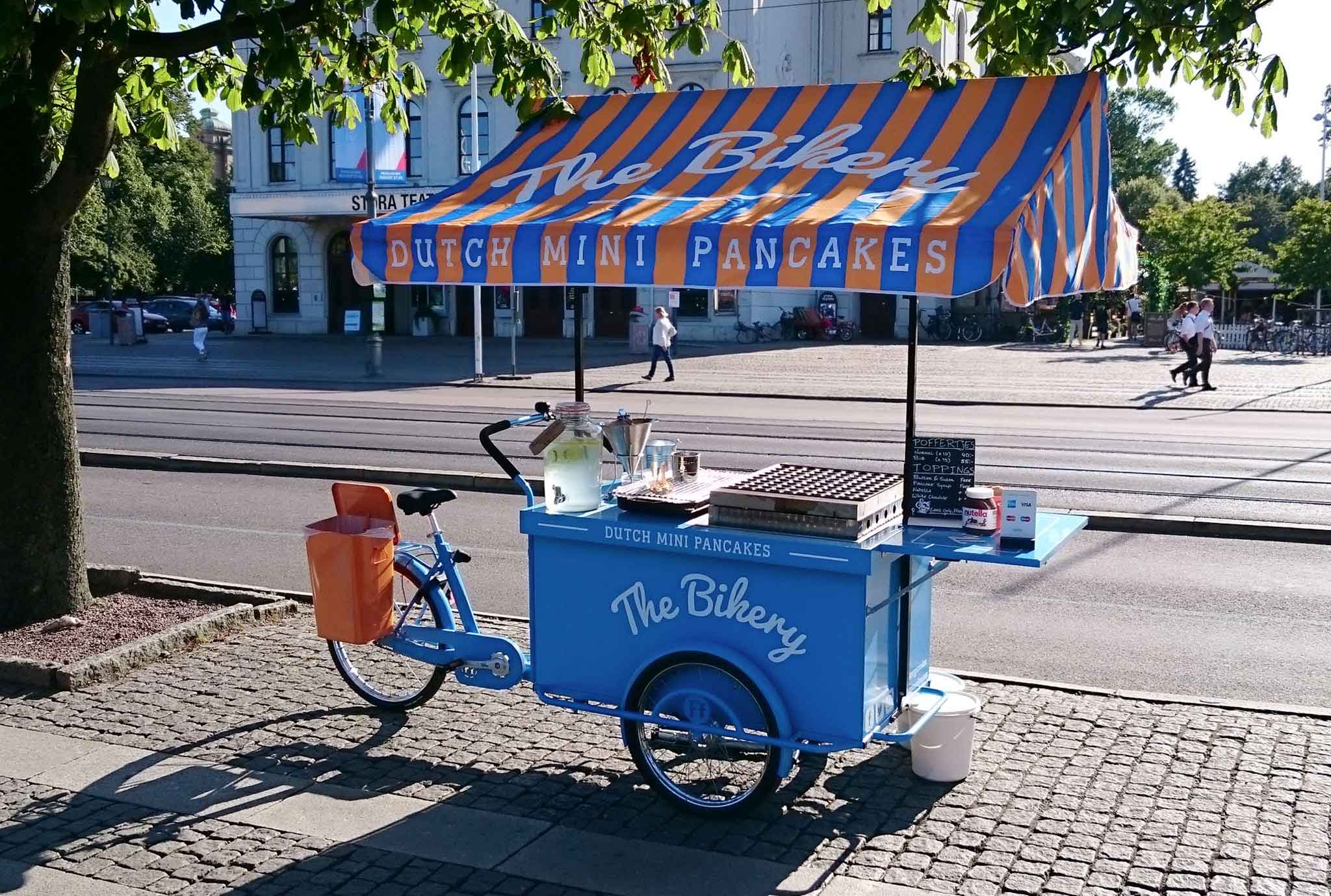
Solution
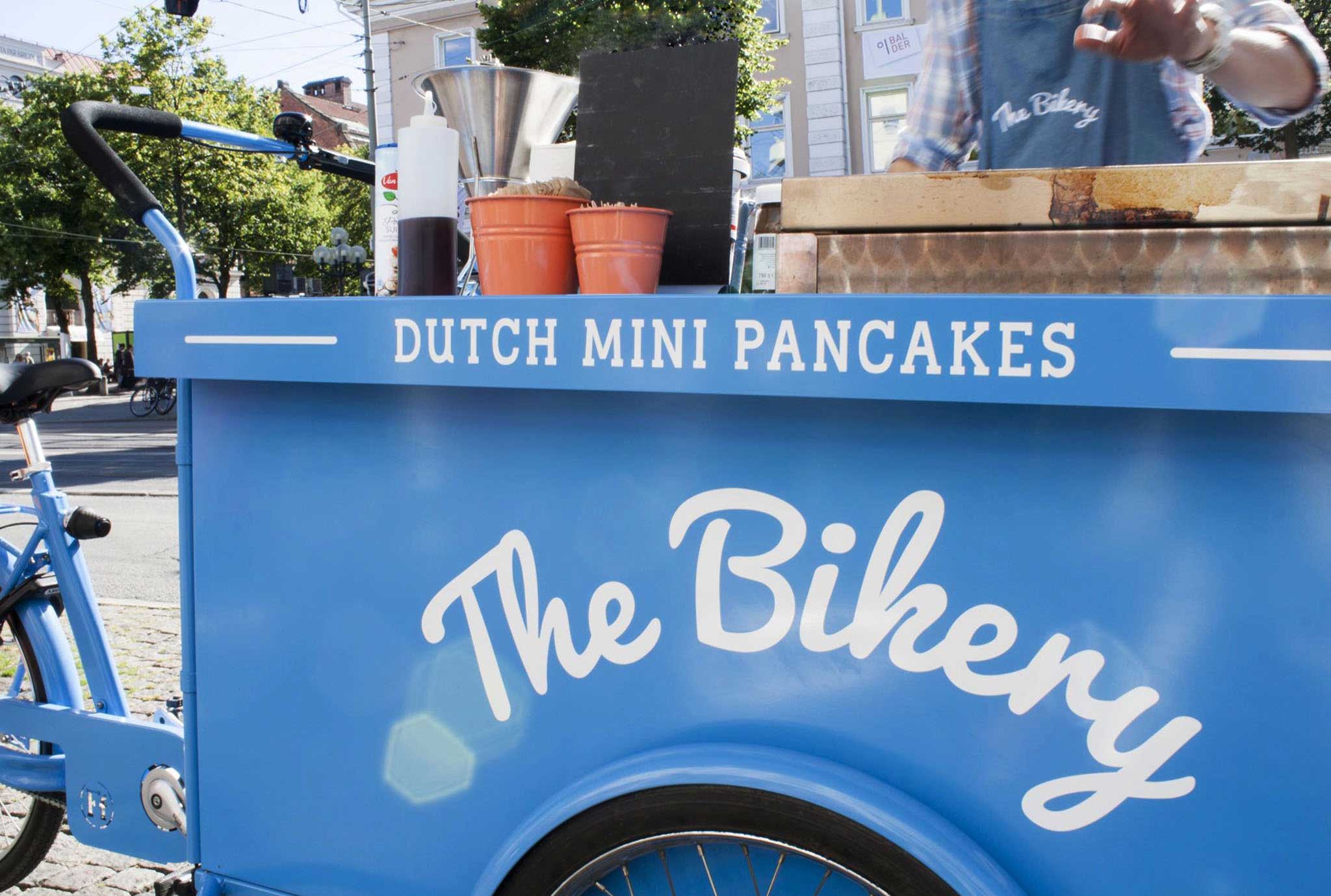
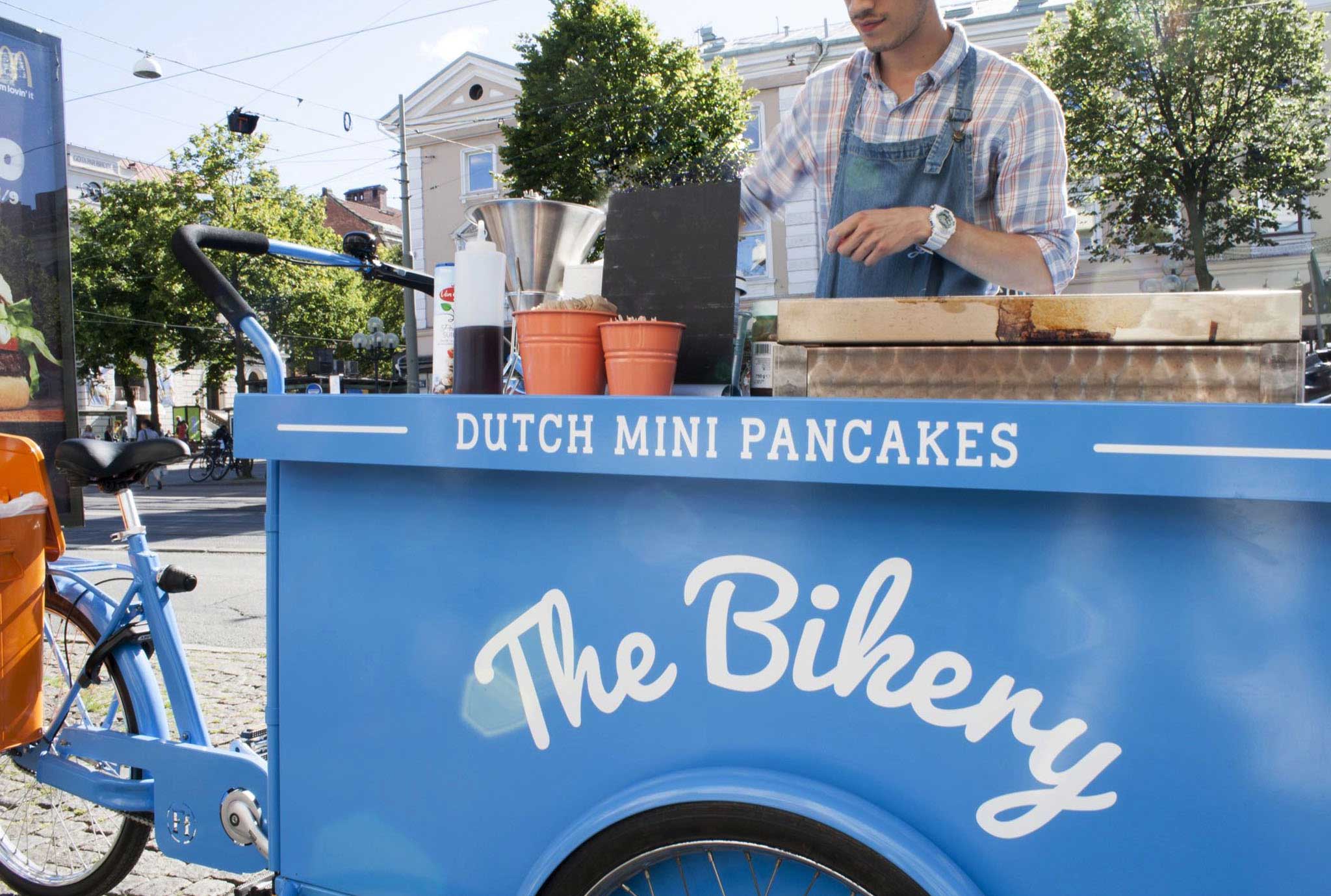
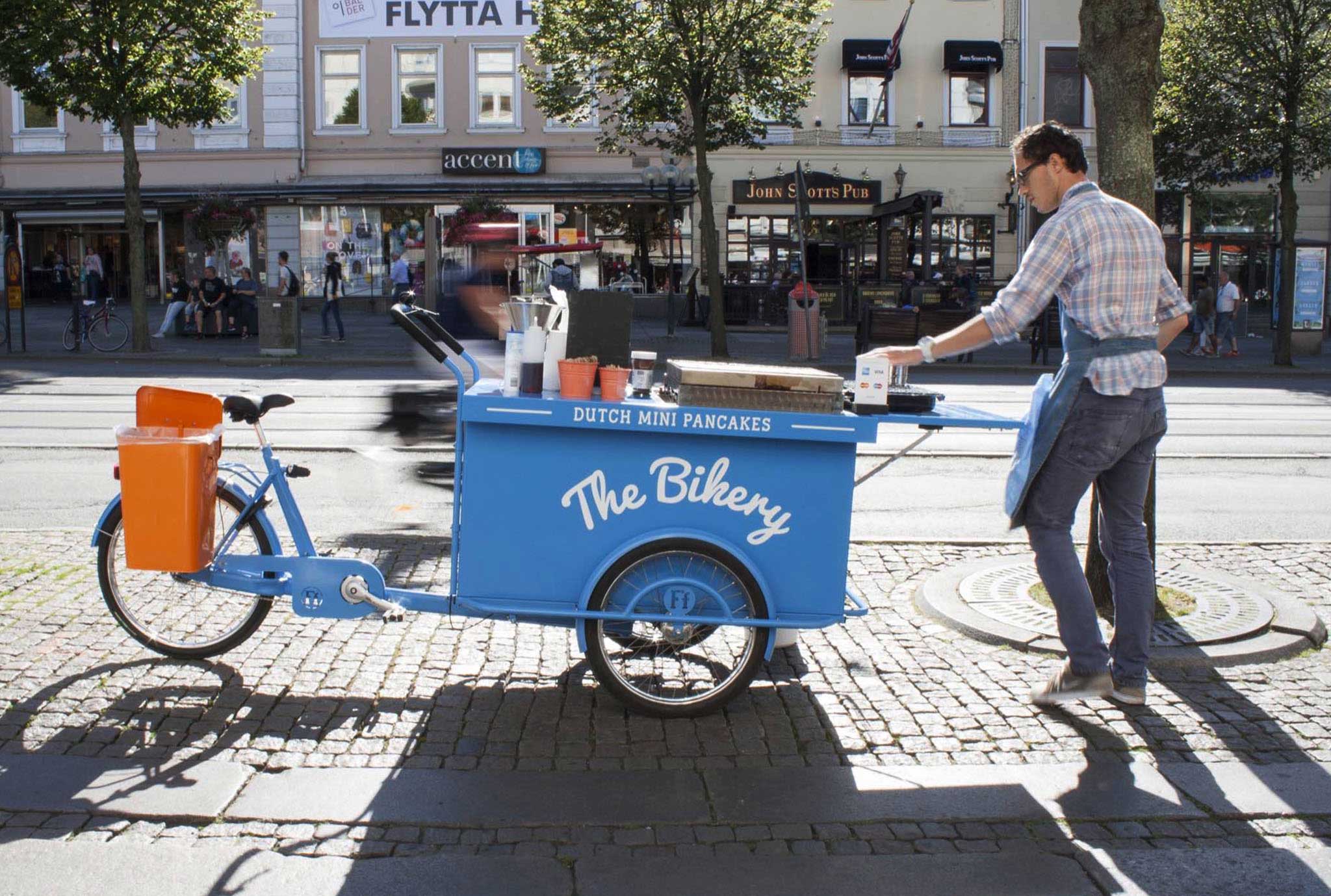
A traditional bakery was an obvious visual reference which consequently brought us to a design solution with classic stripes for the roof and a logotype with a script typeface for a decorative feel. The orange and blue stripes gives that vibrant impression which makes it visible on the street. The stripes are also a subtle reference to the striped Dutch flag and orange is a well-known traditional Dutch colour.
Result
The logotype is dynamic and can be used in three different versions by adding or reducing the number of components, which makes it easy to apply on many different sized areas on the bike and accompanying products. The logo is further customized, and its curve fits well above the bike wheel. The Stroke font Filt Pen is used as a supporting text font for the subtitle ”Dutch Mini Pancakes”, which could be exchanged for other sub-brands in the future.