KKH SPRING EXHIBITIONS
Poster based visual identity and exhibition signage for Kungl. Konsthögskolan/Royal Institute of Art Spring Exhibitions 2016.
Background
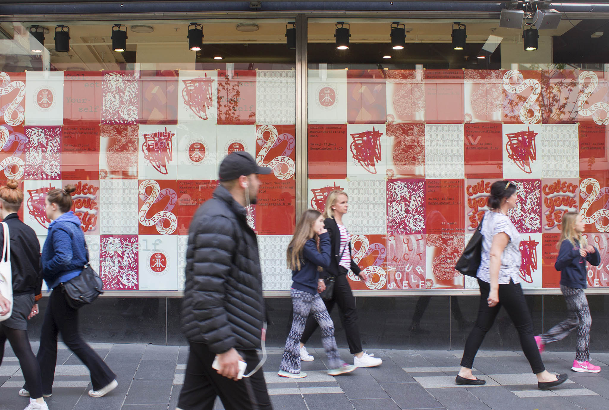
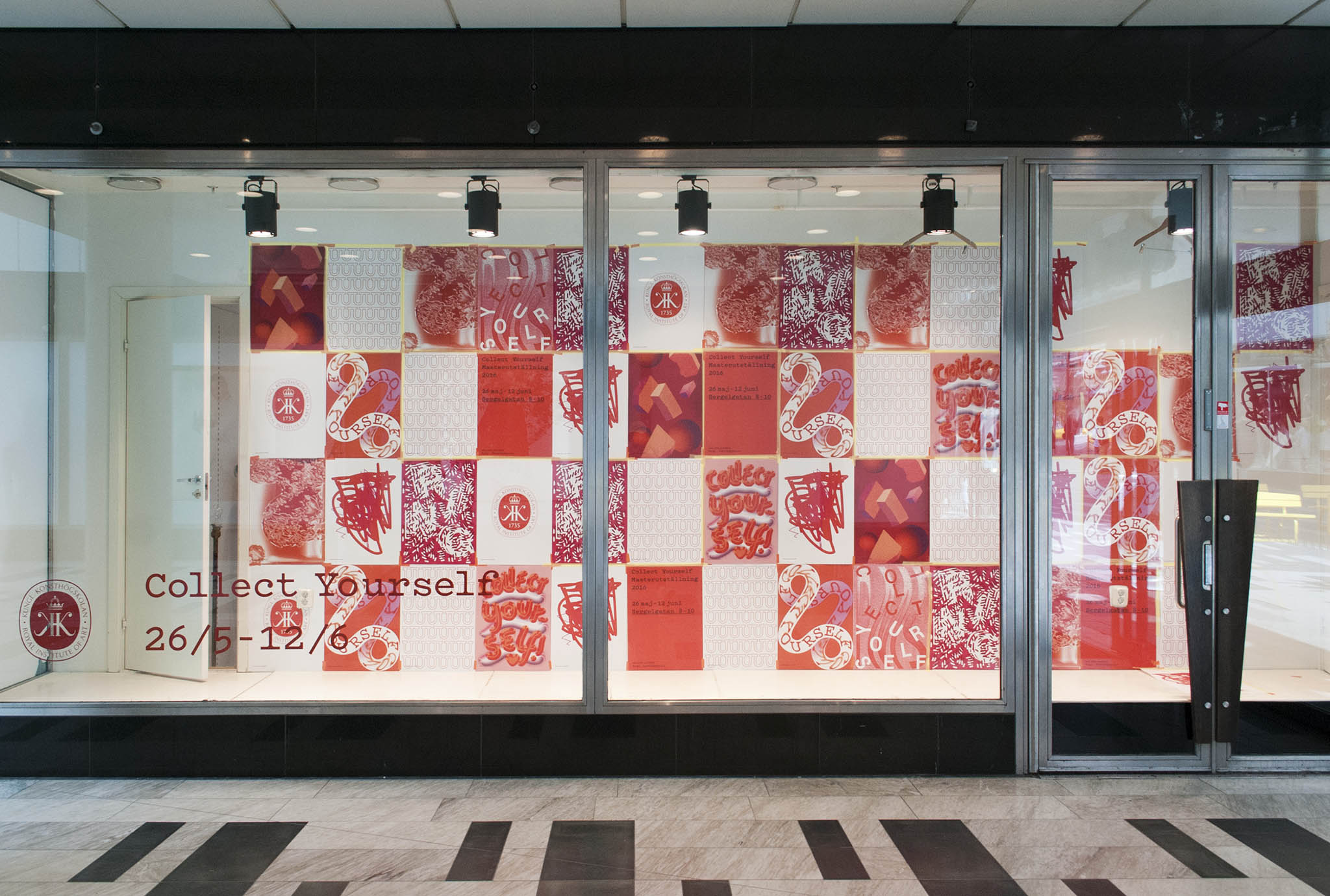
The KKH/RIA spring exhibitions is an annual event where graduating students from Fine Art and Architecture exhibit their work in several separate exhibitions around Stockholm. Summer Studio was commissioned together with the design collective 2typer (Sepidar Hosseini and Moa Schulman) to develop a visual identity for the event.
Challenge
The project was complex, with its 50+ students exhibiting 50+ different art projects with as many different topics. Being 4 designers, each with a visual world of their own, made it even more so. We decided to work with this diversity rather than against it and asked ourselves if it was possible to create a framework that could allow a multitude of visual expressions as well as communicate clearly.
Solution
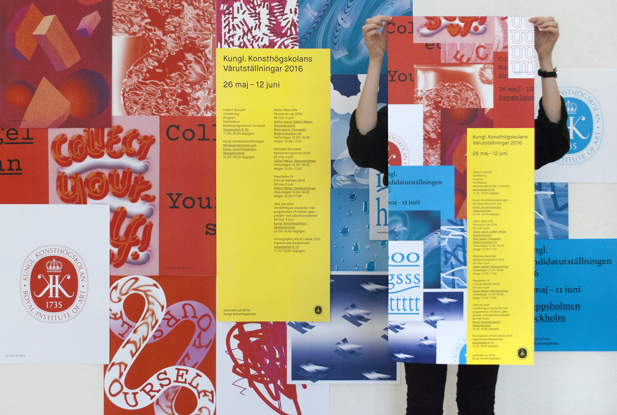
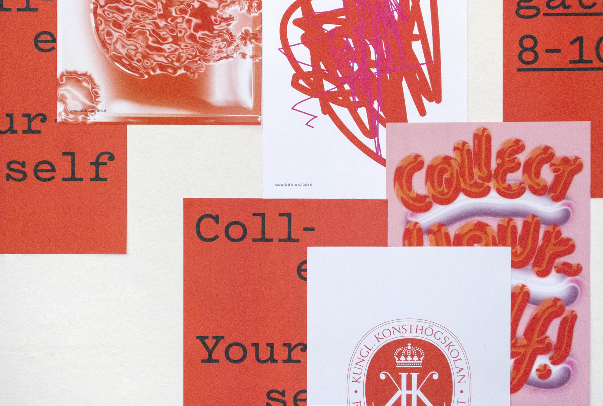
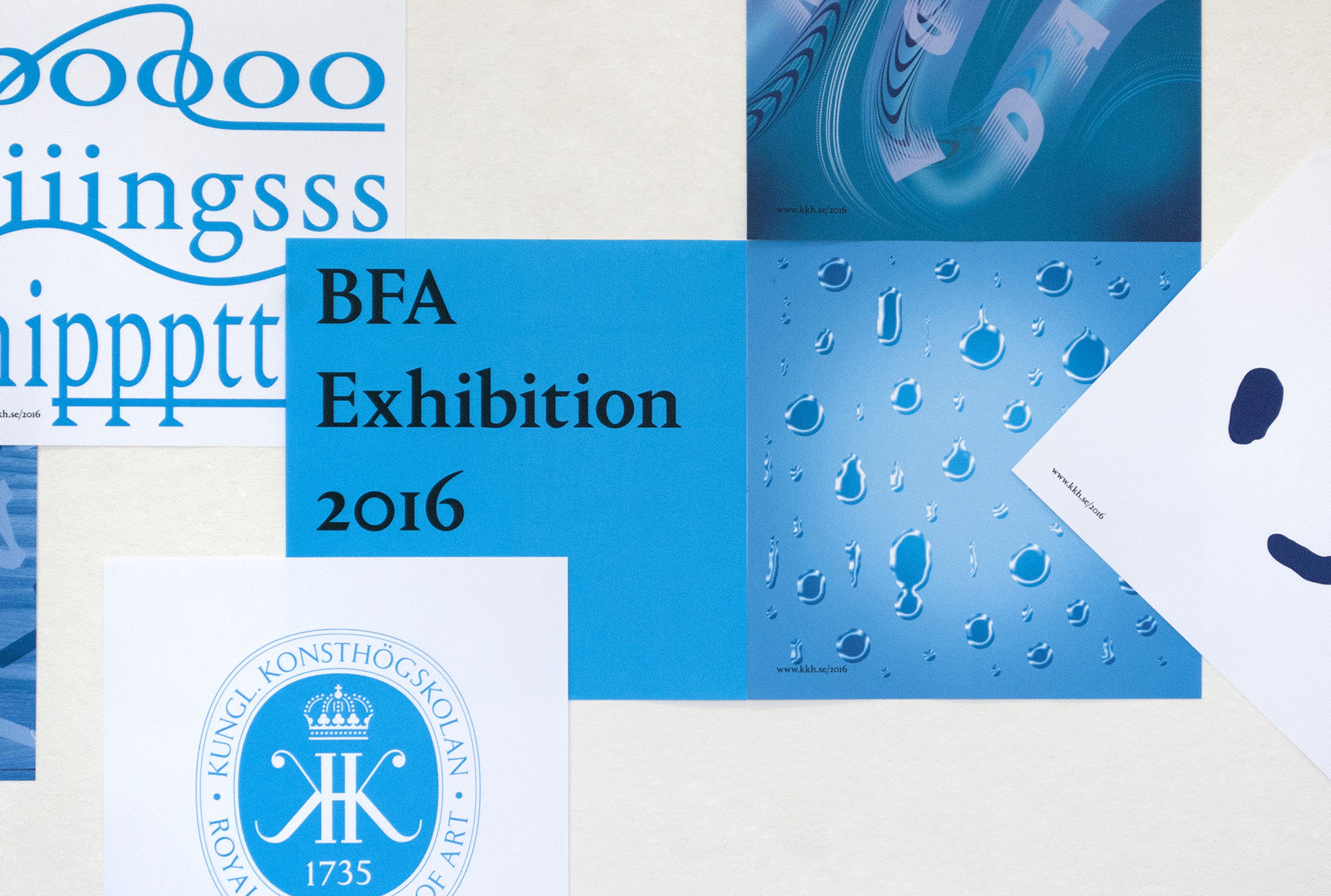
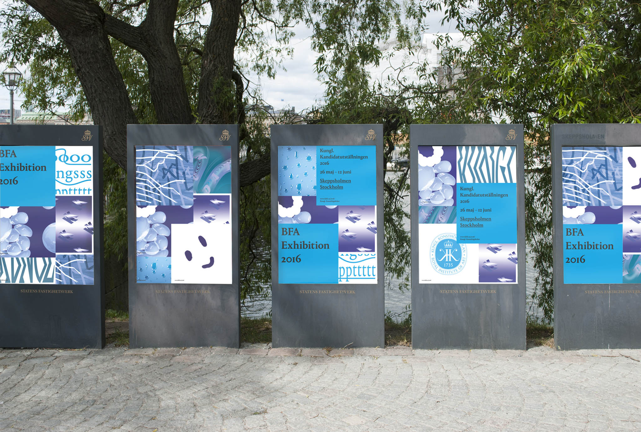
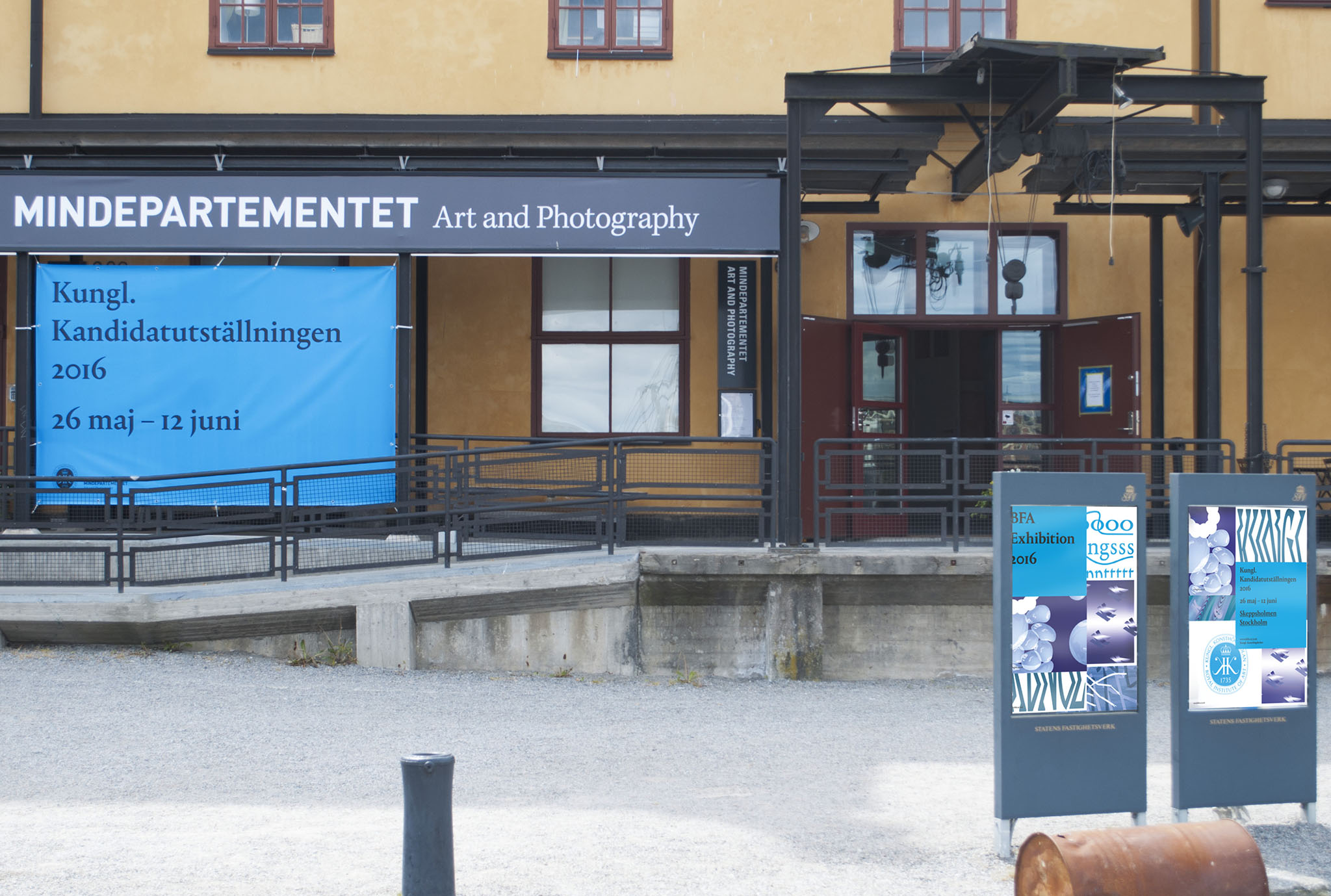
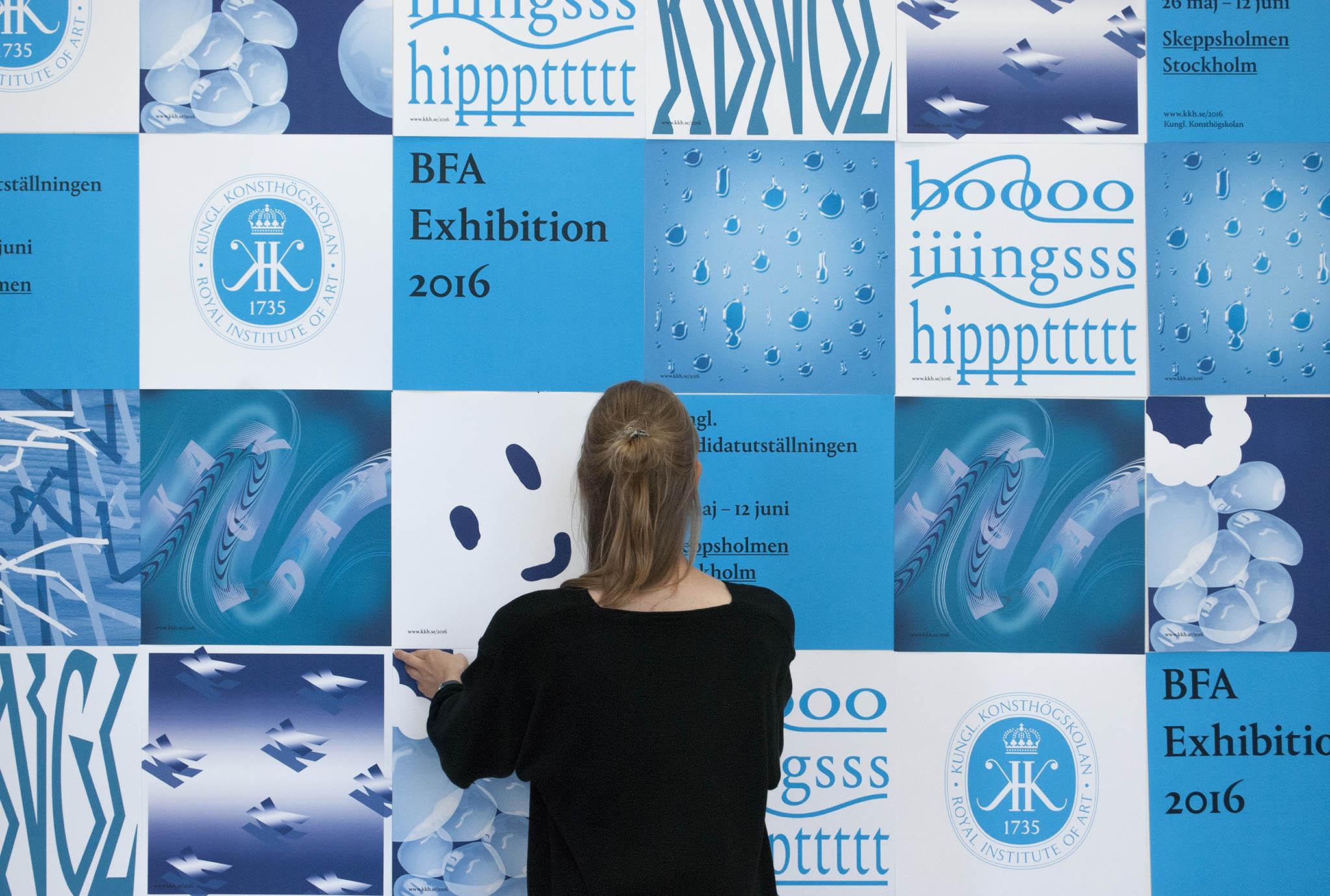
Our solution was to develop a multiple poster identity. This meant that instead of having all the information on one contained poster, we split up the information layers (logo, adress, title, illustration) and gave each layer its own poster. This resulted in no less than 35 posters. The curation of the posters into communication clusters was made by the person posting them. Hence, the design was incomplete without our favourite design principal, randomness and participation.
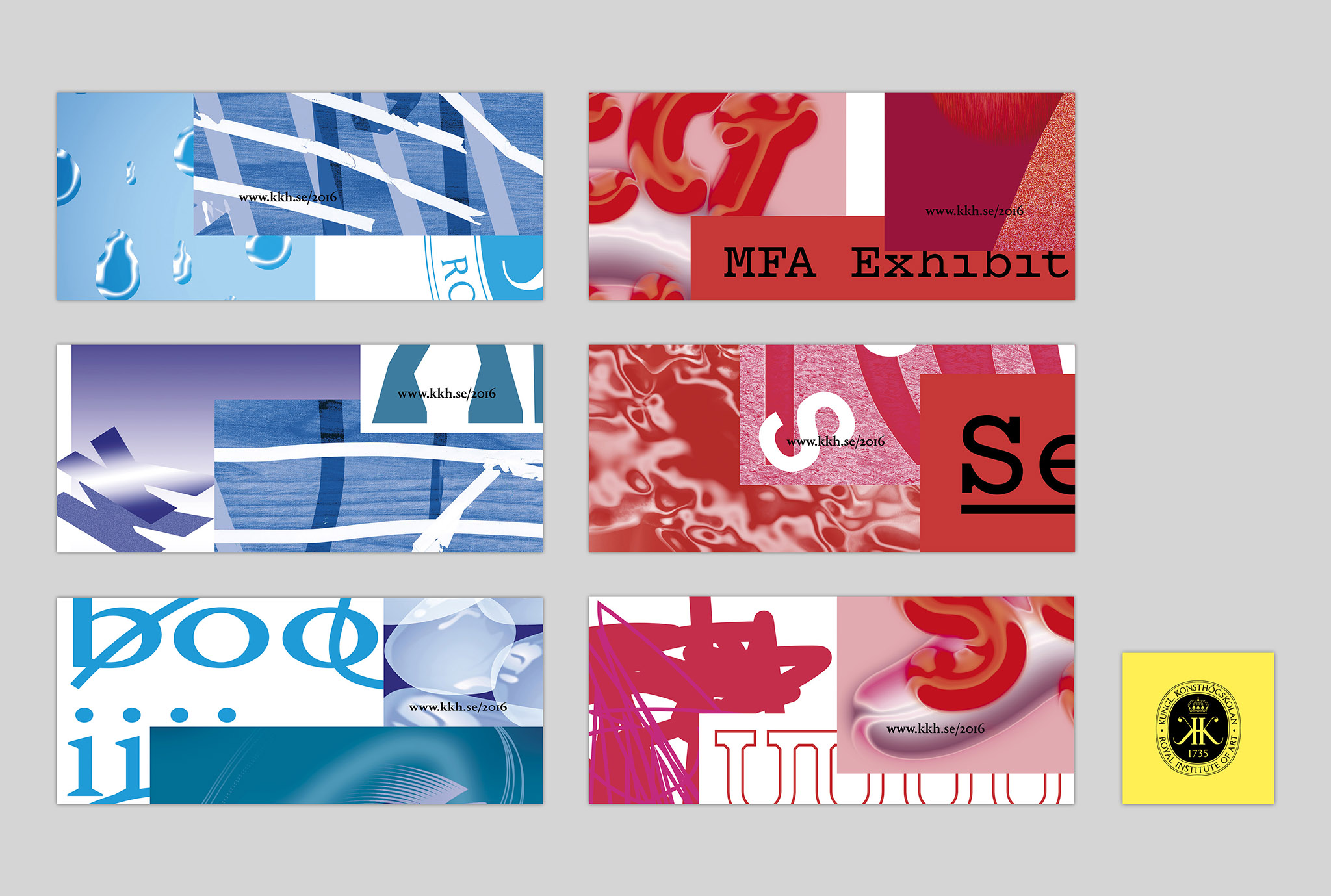
To further represent the multitude and diversity of the students, we based the illustrations on the students’ individual thoughts regarding their work. We see design as similar to a synesthetic exercise, a way of translating an event into something visual. We sent out a questionnaire to gather material for the illustrations with the intention to pick up immediate responses to questions like; If your piece was a temperament, what would it be?
Design
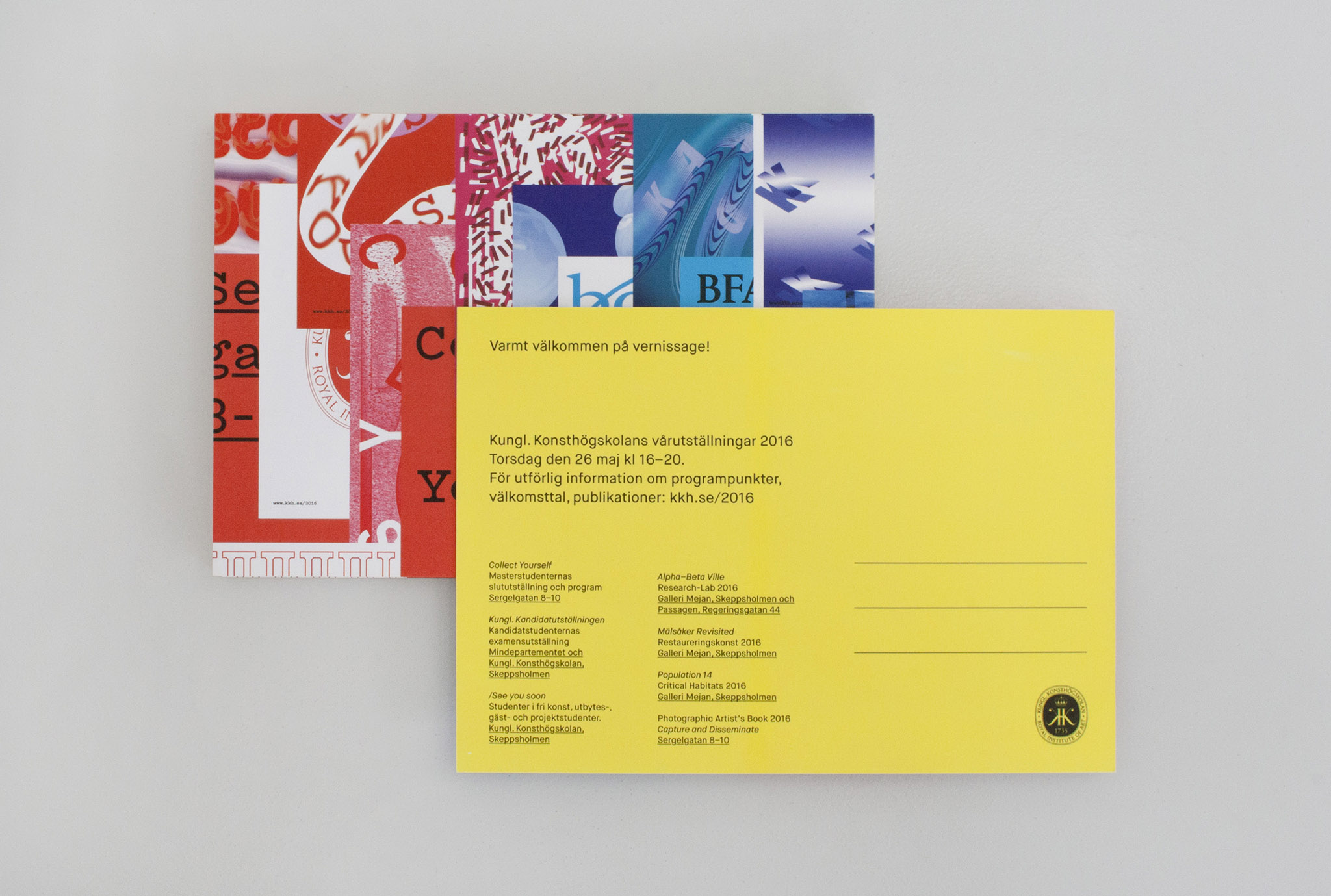
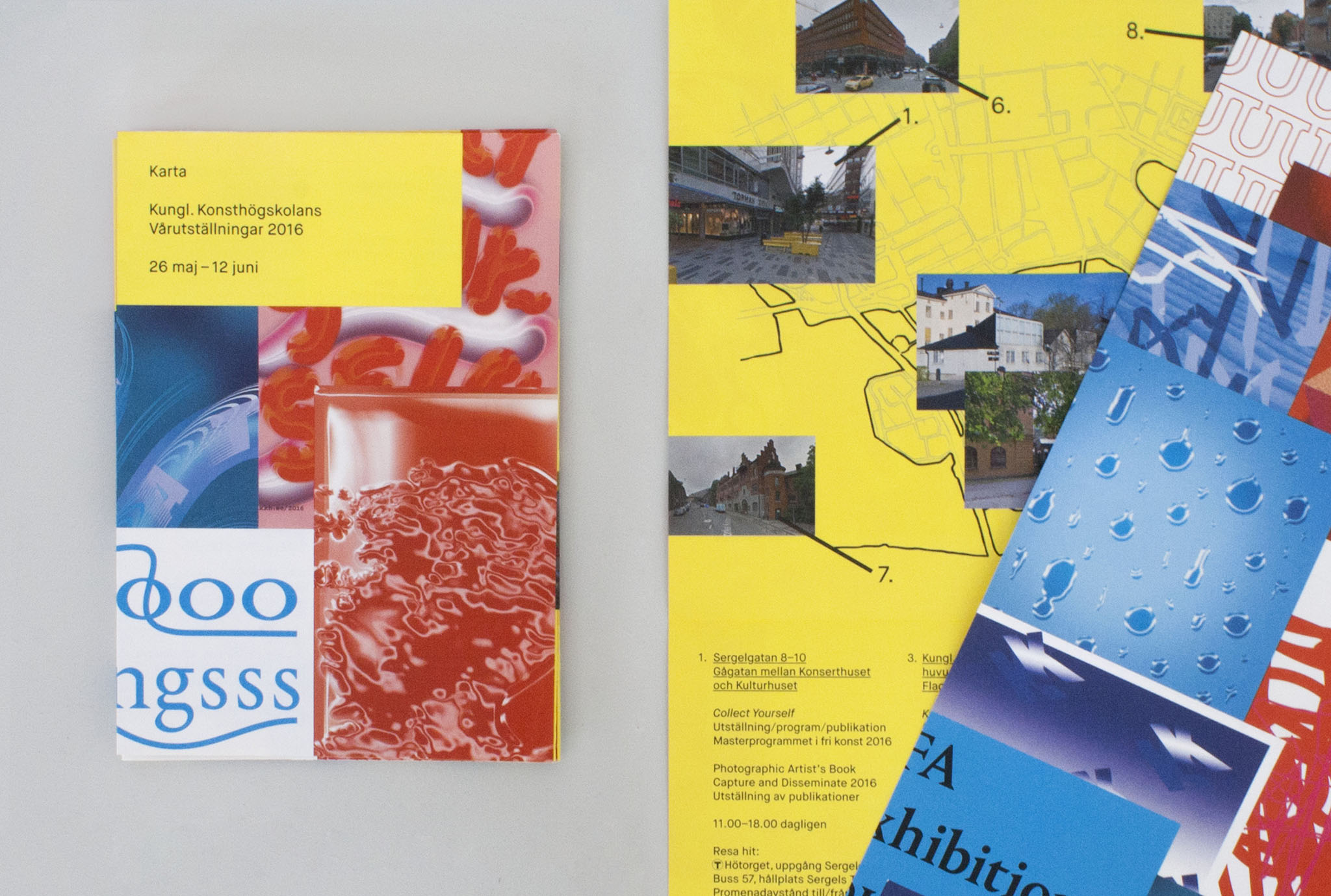
To differentiate the courses we color and size coded the posters, giving the BFA a square format and blue color scheme. The MFA got a contrasting red color scheme and a longer, rectangular format. Information regarding the spring exhibitions as a whole was communicated with an additional yellow poster. We also developed an overall identity that were used where clusters of posters was not an option such as invitations, social media, maps etc.